Chef Boy-ar-dee Re-design
The Brief
Chef Boy-ar-dee is a beloved canned pasta company that is geared towards family, and more so children. In this project I wanted to take something that was marketed for children and move it up into the 20-35 year old age range. The design had to be clean and modern with a long lasting identity.
The Execution
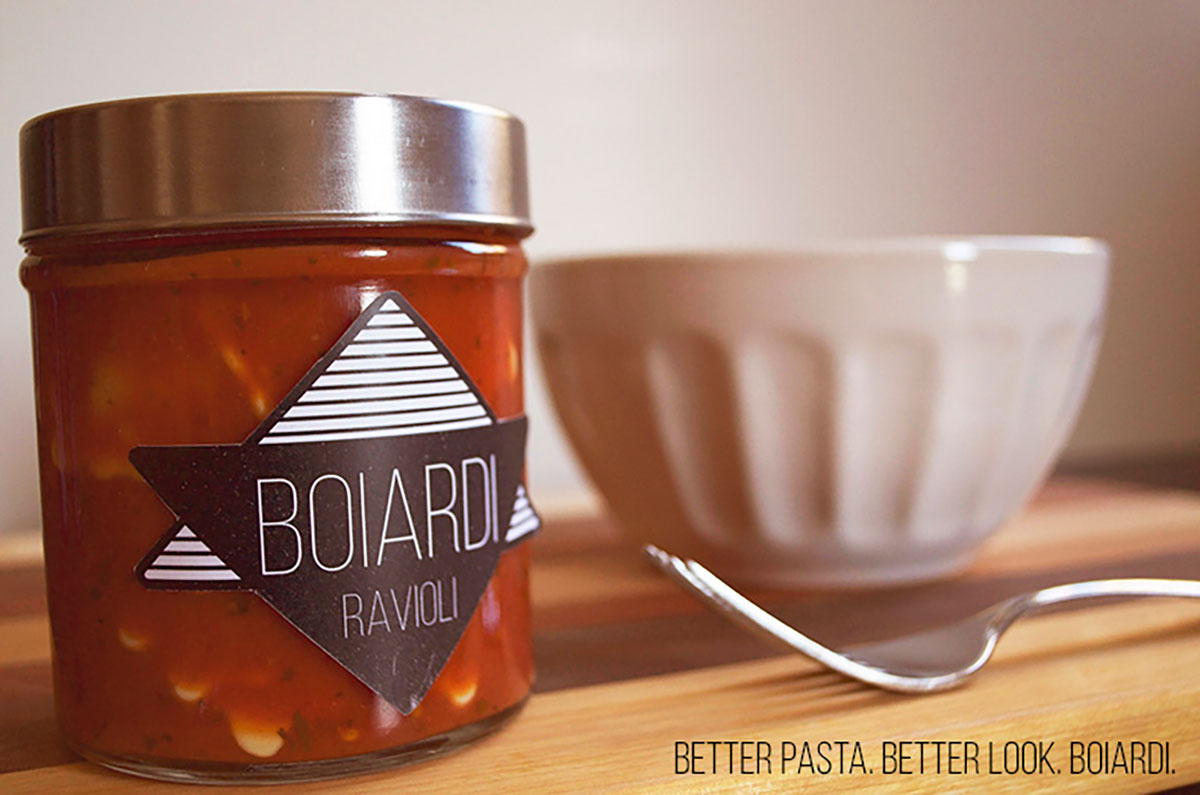
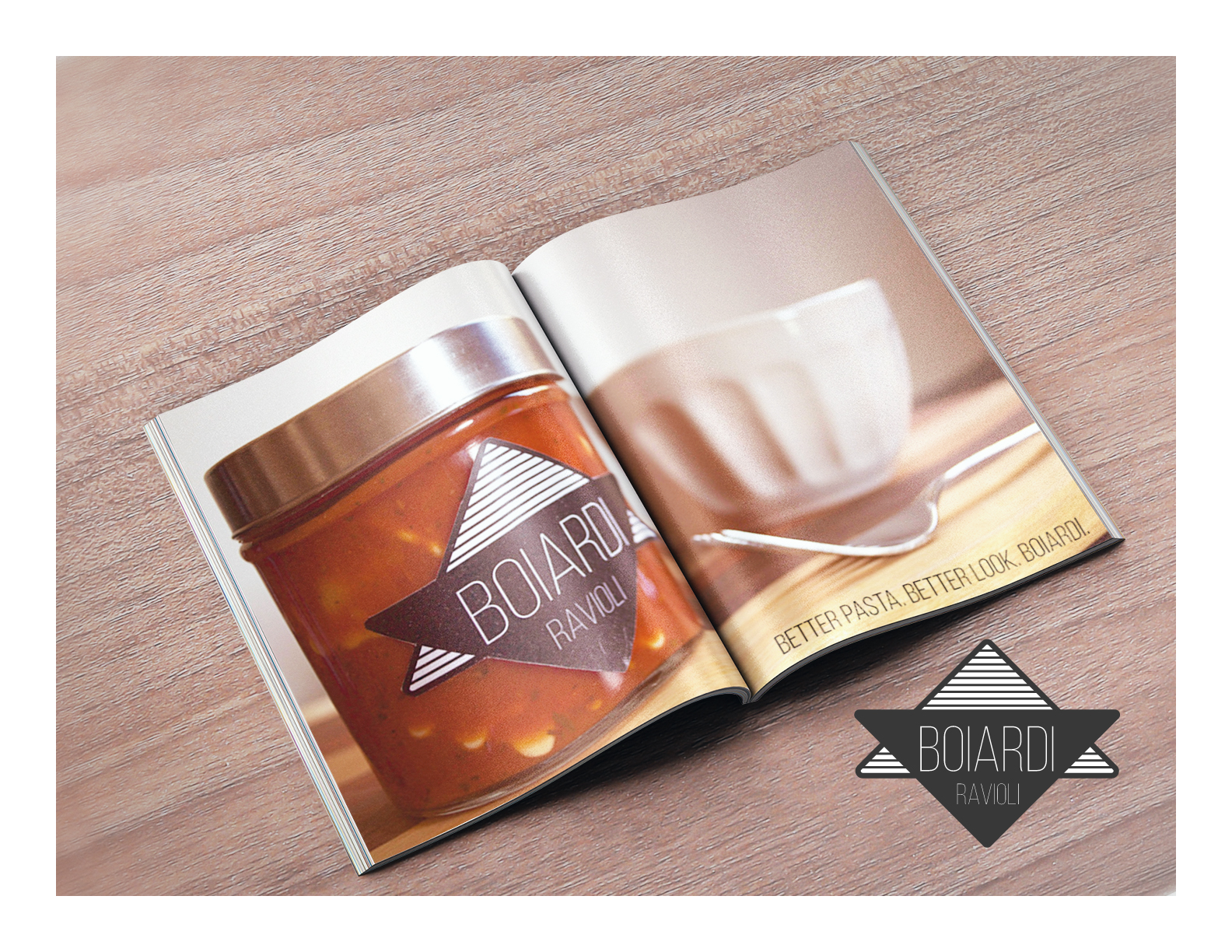
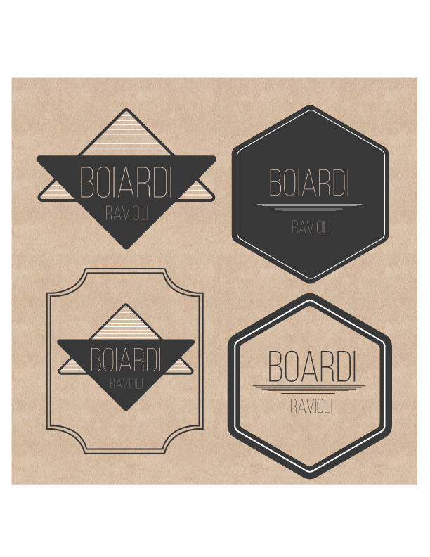
Creating a strong logo and package was the most important part of this design. The logo had to be clean and elegant. First, I went back to the proper spelling of Boiardi - instead of the current phonetic spelling the company uses. I wanted to take it to an Italian inspired design with some basic shapes and a light long typeface for the logo. A charcoal grey would pop off of any light, as well as bright colors that I put onto the can.
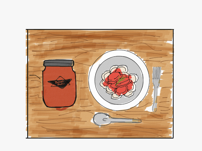
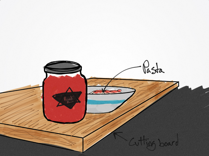
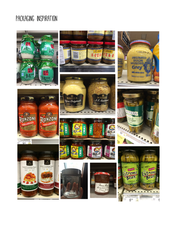
After making the logo I wanted the package to be a jar so it would show the sauce and pasta; linking the product to a more posh and healthy lifestyle. When you can see what you are going to be eating, and it is attractive, you will trust it a lot more.
Final Concepts
The ad had to be reductive and feel like it could be in any home, so taking a simple and minimal photo made the ad pull together.