MacEwan Design Show Website
The Brief
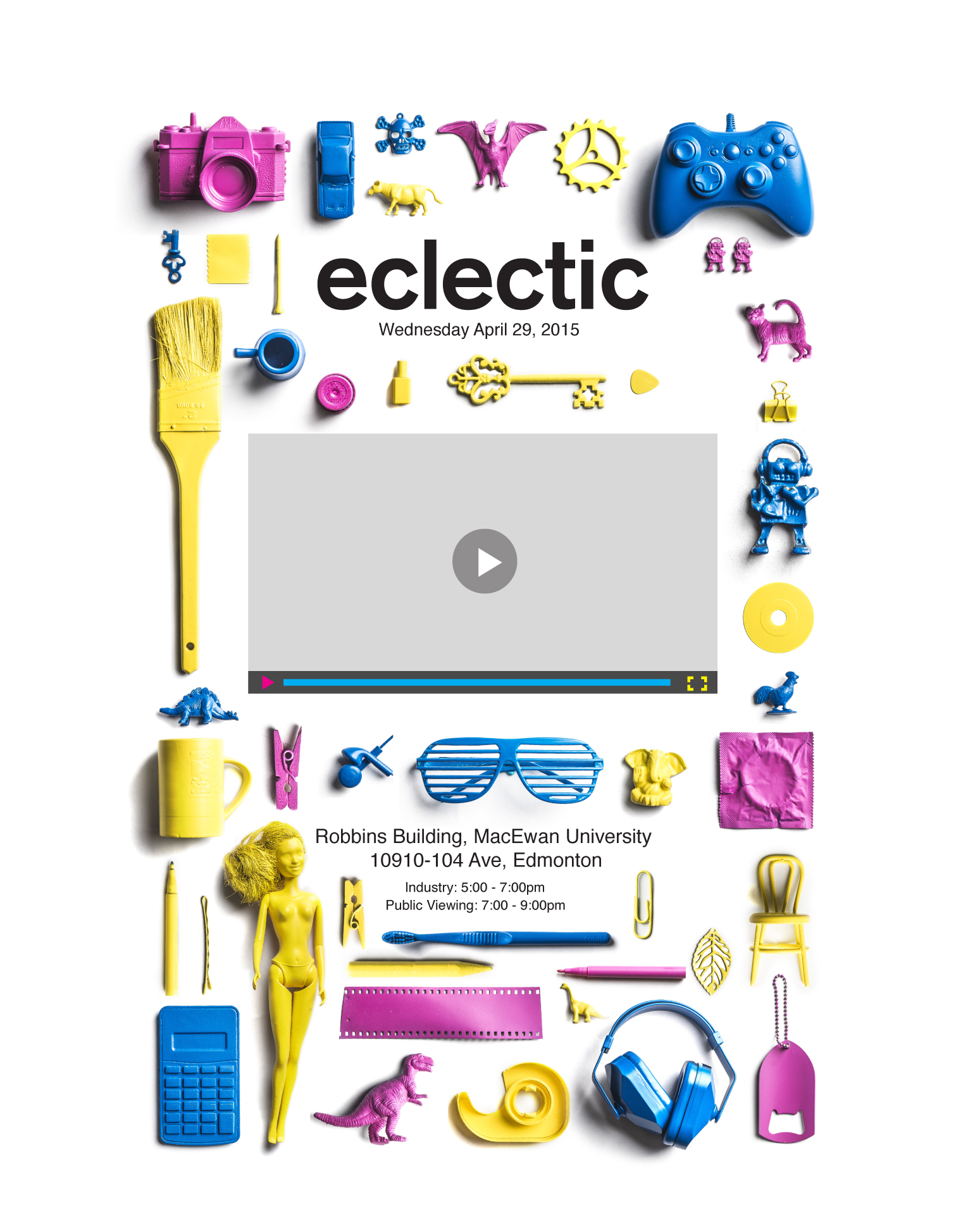
After the MacEwan Design Show concept was chosen, they needed a website. The website had to stick with the core themes of the chosen concept which was “eclectic”. The concept was simple, we are all eclectic people and we have a lot of interests that come together to make us who we are, and those interests in turn influence our design. The project creator wanted the togetherness expressed as well as the quirkiness of each of the students.
The Execution
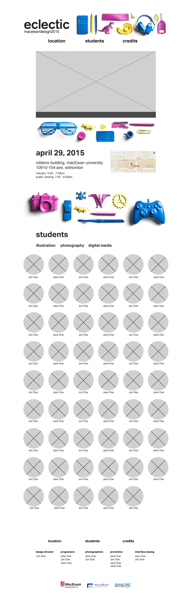
A lot of the heavy lifting was already done on this project. A color pallet was chosen, the concept was there and I had a poster and visual identity laid out for me. That being said, those were also constraints that I had to adhere to. Initially I kept the website very reminiscent of the poster that was already created, but this didn’t feel creative enough, nor did it express what the creative director, or I, wanted.
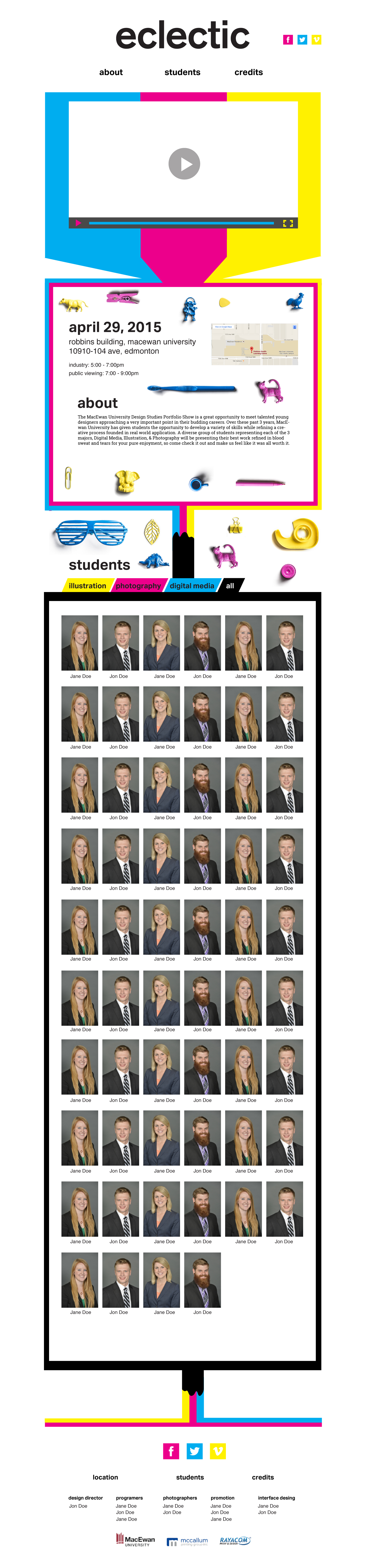
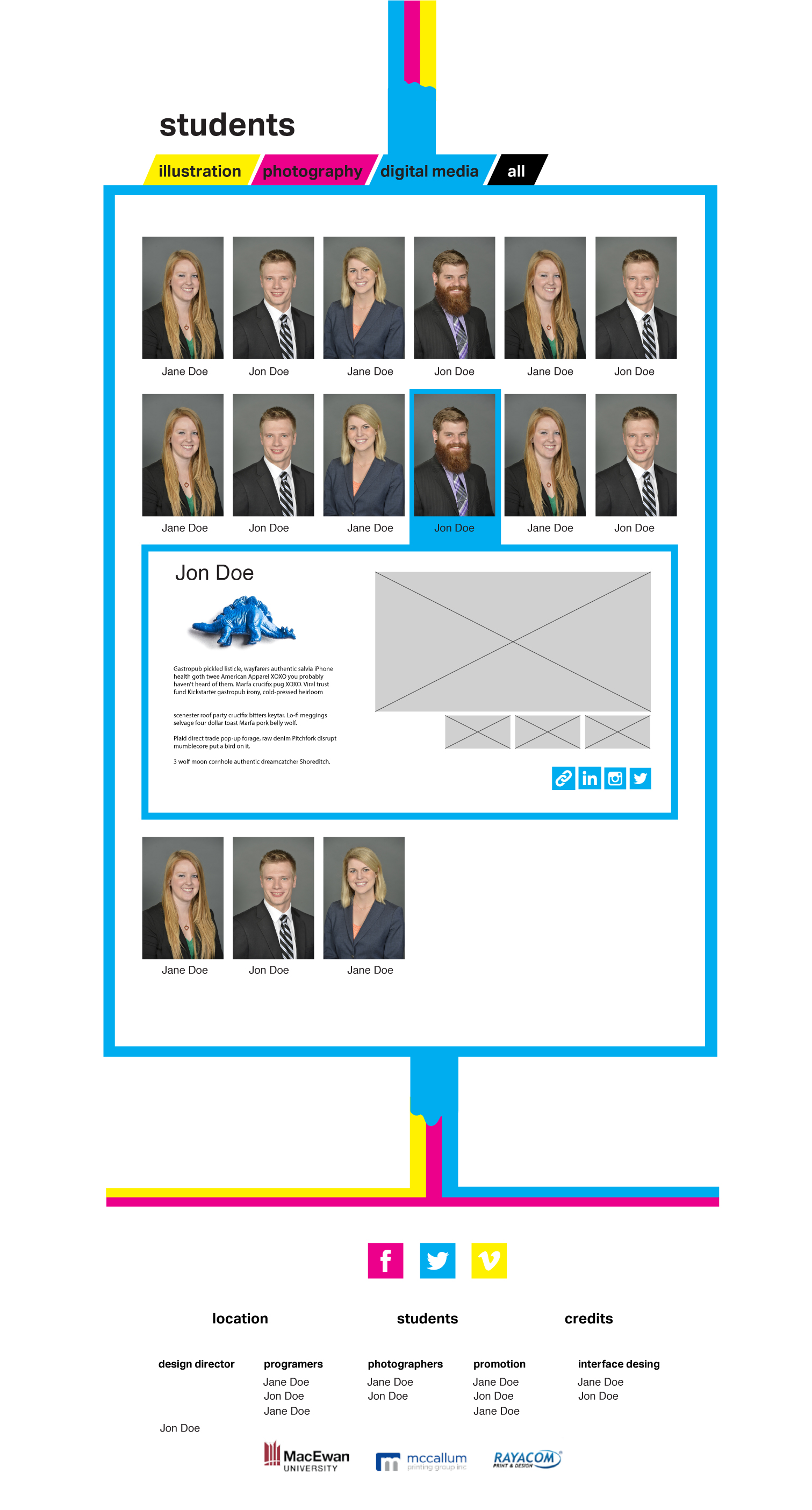
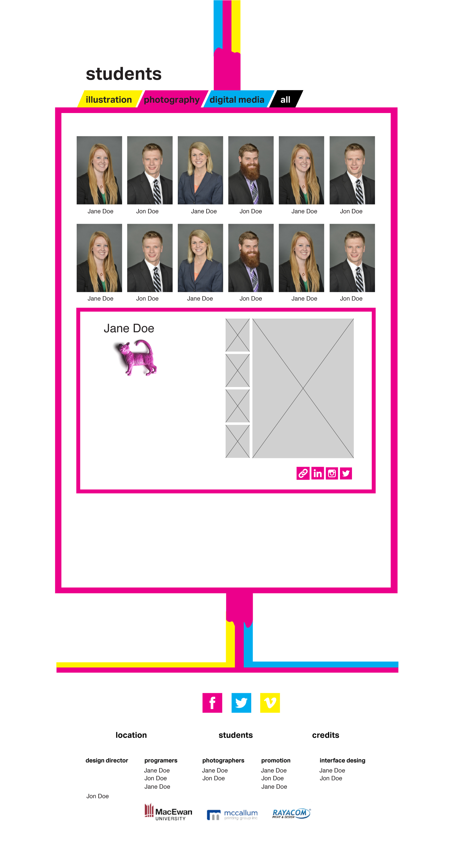
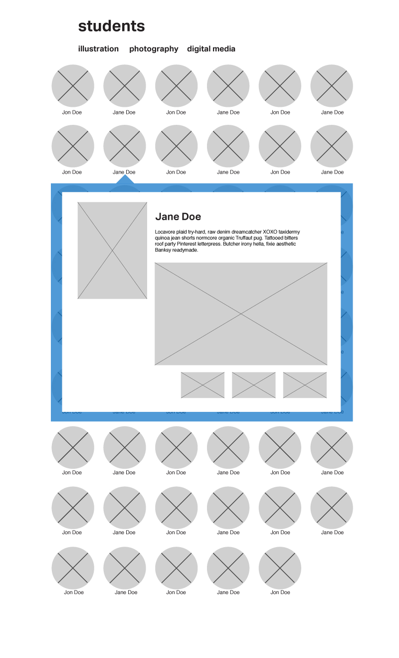
Pushing on past the poster and creating a completely separate design but still tied very tightly to the original concept was where I took the project. The main idea behind the design was to show the CMYK colors (which was the color pallet chosen) and combining them together to get black, a common thing we know as designers. So the colors would pour around important information, highlighting each section of the site. The filter on the site would have different colored backgrounds associated with the major and their associated color, showing all of them together on a black background.
Final Concepts
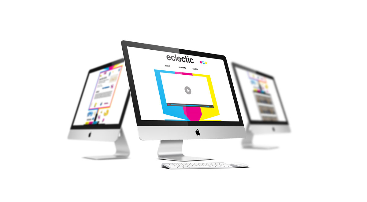
The site came out quirky and fun, which is exactly what I wanted. Pushing the colors and making them a major part of the design really made this design stand out for me. In the end it didn’t get picked for the show but I am still quite happy with how it turned out.