World Food Crisis Infographic
The Brief
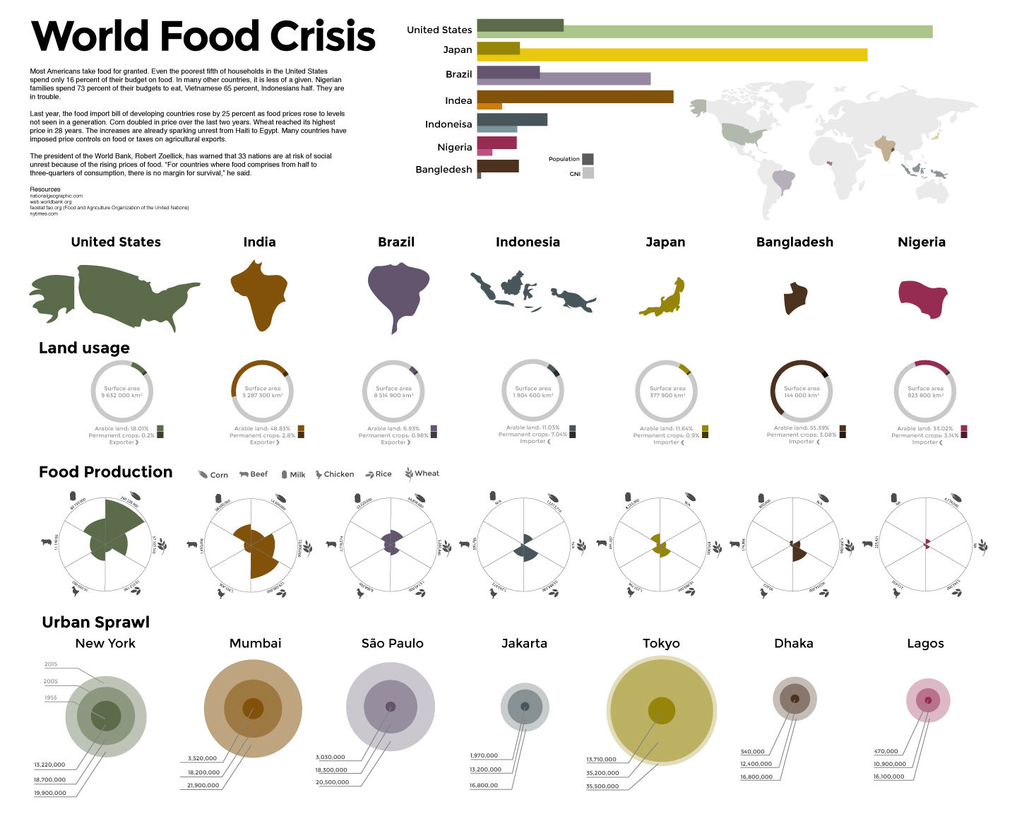
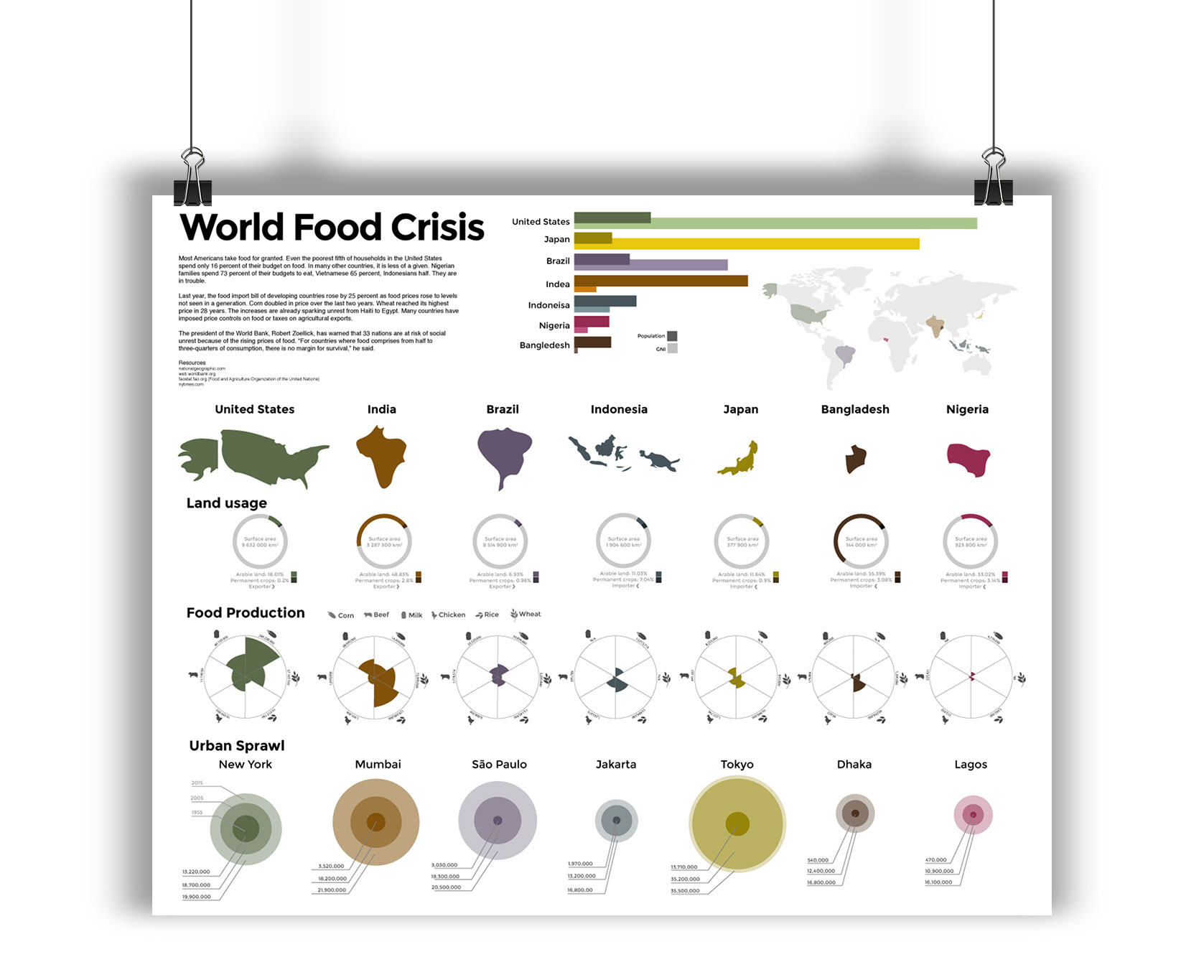
For this infographic I was supplied with the information about the world food crisis, and had to fit all of the information into one poster. The information had to be grouped in a way that promoted scan ability, readability, and easy comparison between the highlighted countries.
The Execution
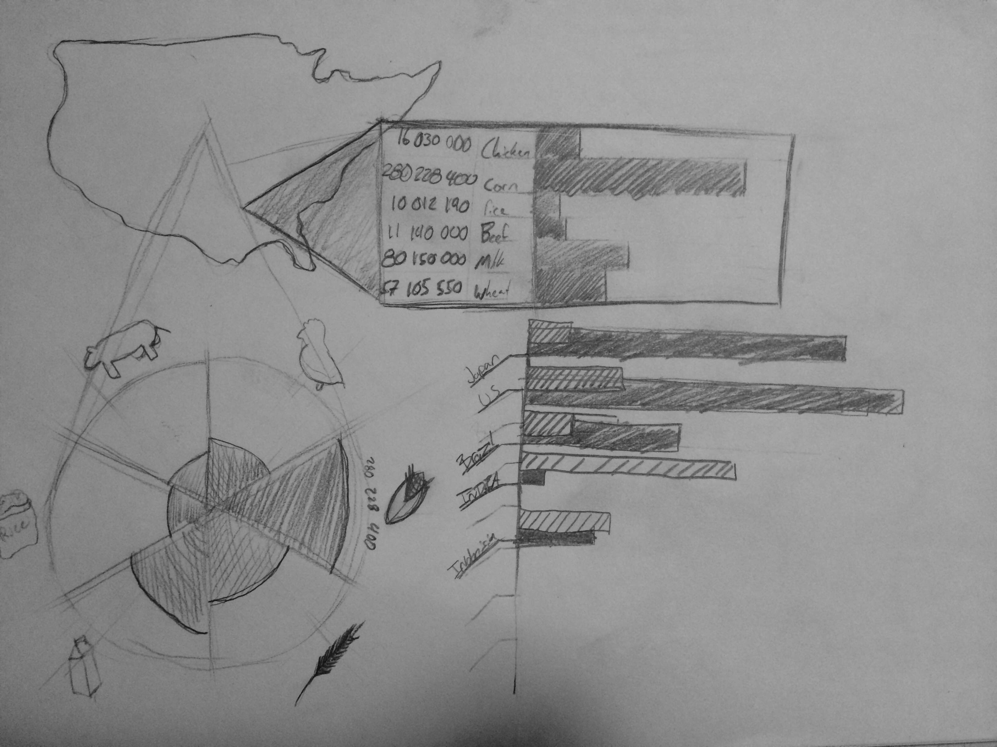
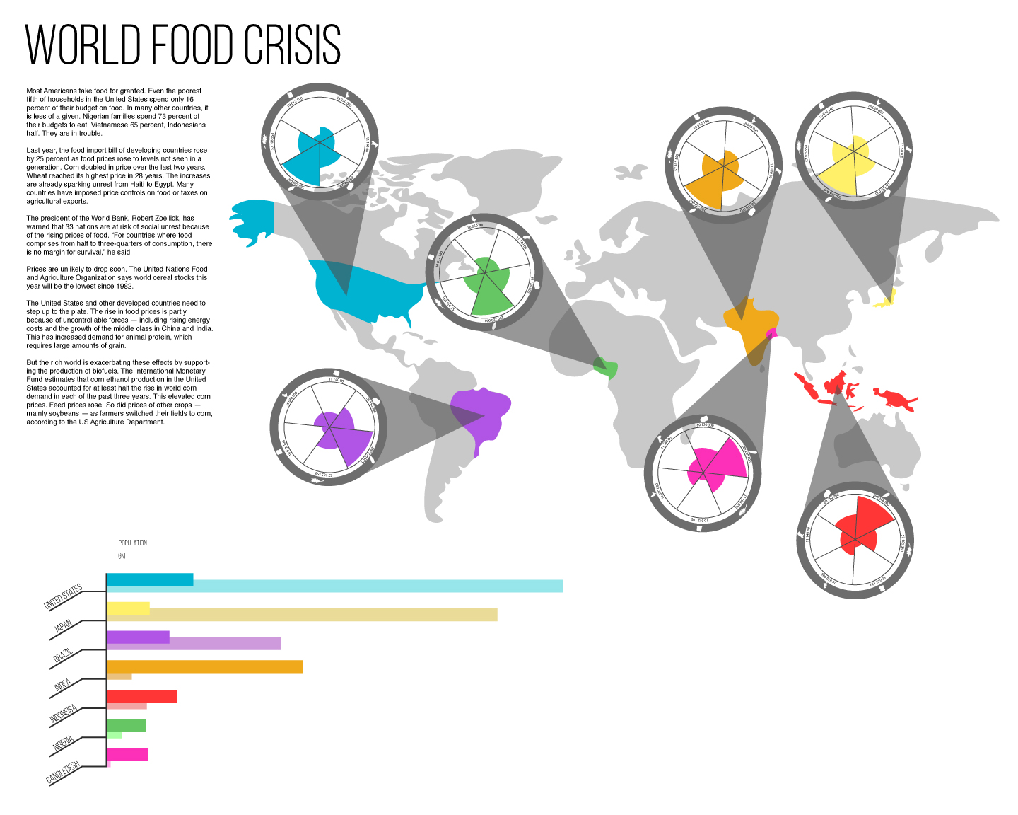
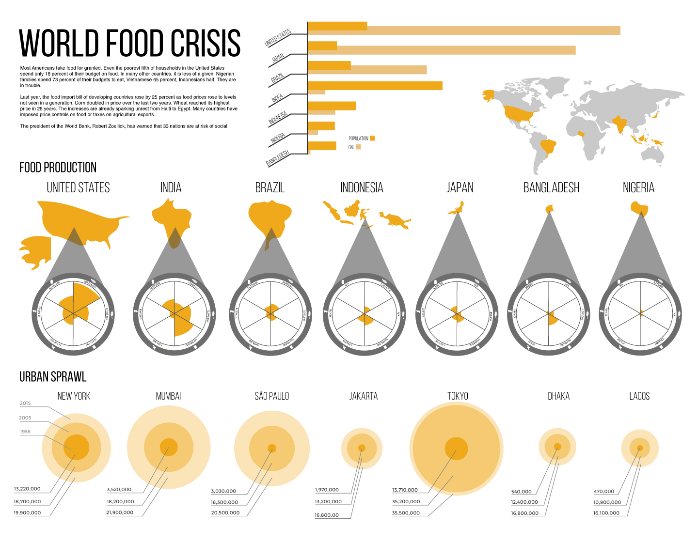
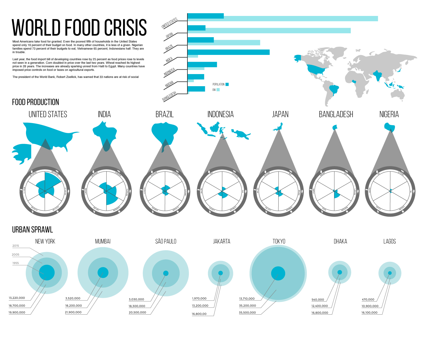
First, I had to figure out exactly how all of the information should be represented and the best way to compact the information in a reductive and readable way. Making the food production into a circular graph would allow people to get an idea of the production differences without having to read the actual numbers, then layering everything in columns and rows allowing the viewer to scan and easily chunk out the information that they wanted to compare. After a few revisions, I created a muted color pallet so that the poster didn’t feel overly happy because of the subject matter. After the color pallet and layout was complete, it was just a matter of final adjustments to the icons and alignments.
The final poster is an airy feeling design that is composed of a lot of information without feeling overwhelming to the viewer. It also allows someone to quickly understand the disparity of some countries.
Final Concepts
The final poster is an airy feeling design that is composed of a lot of information without feeling overwhelming to the viewer. It also allows someone to quickly understand the disparity of some countries.