Royal Alberta Museum Re-design
The Brief
This project was to take the current Royal Alberta Museum visual identity and bring it up to a more modern look and feel. The identity that was needed had to be versatile, so no matter what it was applied to it looked strong, professional, and clean. Overall the design had to be created to last a long time and have a concept that is behind it that would be relevant years later.
The Execution
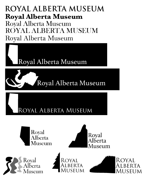
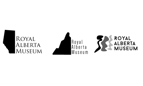
Initially I was going to take the current identity that the museum had and just improve and modernize it for a contemporary audience. The current identity, though, had a mammoth head and used Trajan, which could be made much more modern.
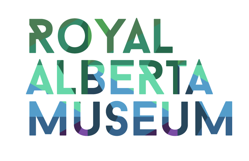
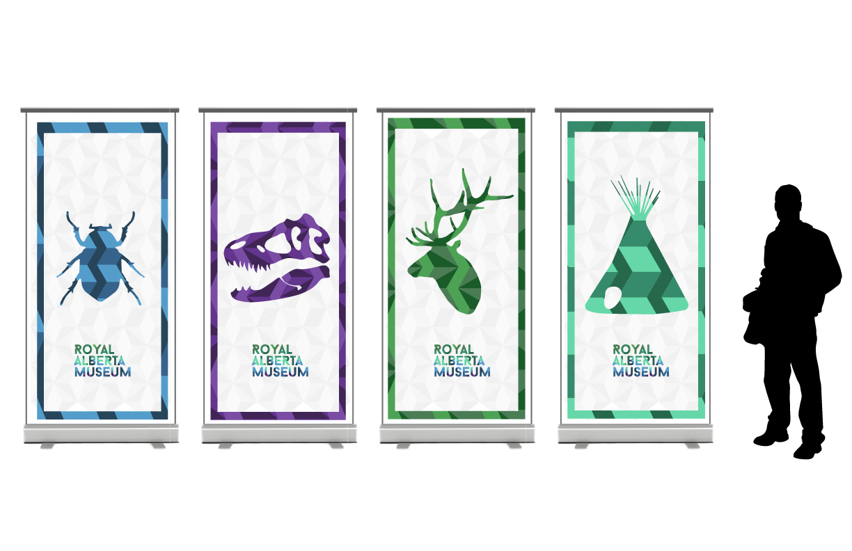
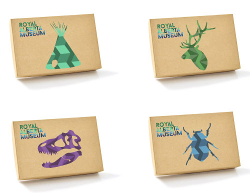
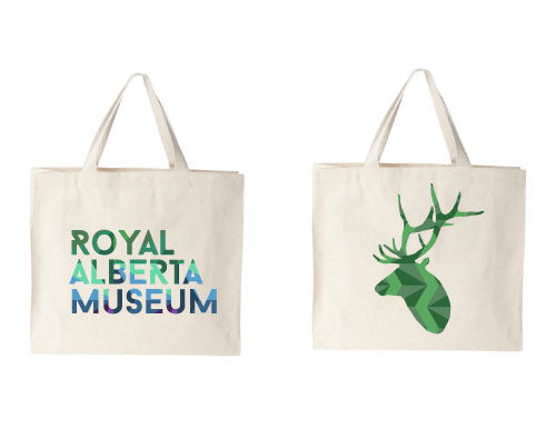
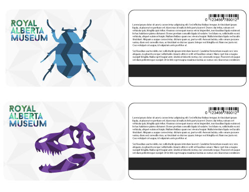
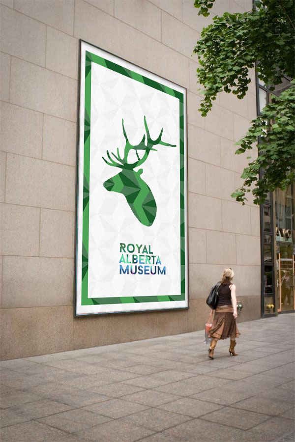
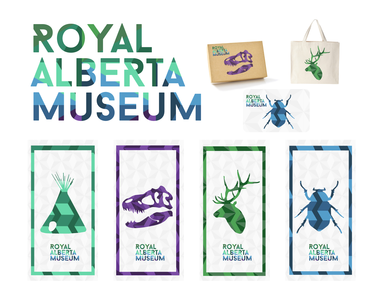
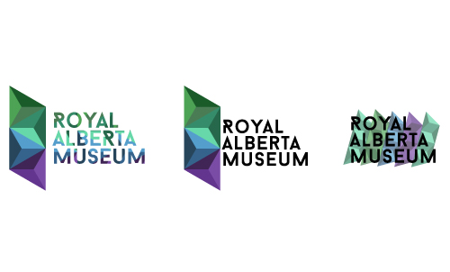
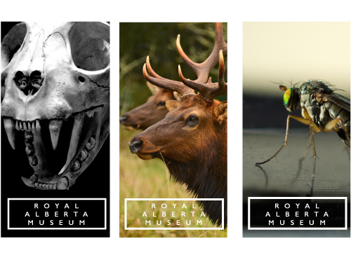
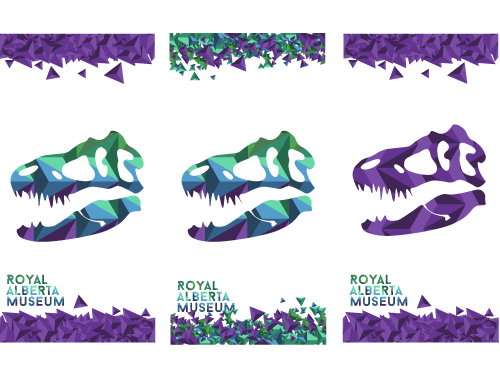
After exploring this I found the better approach was to take a new spin on the identity and create something completely new. One of the main inspirations I had was the Northern Lights. In Alberta, we see some specific colors in the Northern Lights, which are purples, blues and greens this influenced my color pallet. I expressed the movement of light in a geometric pattern and used shades of the colors to show depth. In the end, and after much exploration I arrived at what was the best choice. The poster graphics would be applied to everything form, pull up banners to street posters. The icons themselves allow themselves to be shown with or without the word mark and easily be recognized as part of the brand. In the end, the word mark itself is bold and clean with the geometric pattern with all of the colors incorporated, pulling the whole identity together.
Final Concepts
As you can see the identity is flexible and can be applied to various different pieces of collateral and still be easily recognizable.